What is mixed media? Where do I find my inspiration? How did all the layers of tape happen?

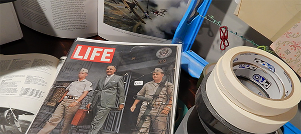
I was immediately drawn to the faded look and feel of the old paper because of the browning of the edges, the tiny text and the old vintage ink. I knew I wanted to not only use this vintage articles as a reference but actually rip and collage this material right onto the surface! I thought about how this would add an element of texture and depth and a story literally right to my piece. At this moment, I realized I wanted to explore depth and textural elements

The magazine I bought was only a few bucks but the more I thought about it, I couldn’t let myself rip up the history. I began to hunt for old maps and aerial views; again something old and faded. I liked the idea of layering the words, the text and the textures of the lines of the old thin paper. I envisioned the airplane to be abstracted appearing to be flying over this layered surface in the sky but I couldn’t find maps, and much like the magazines and books, I hesitated against the thought of ripping up a piece of history. I thought about photocopying the pages but the paper just wouldn’t have the same look and feel, so again the canvas sat.
The more I thought about it, the answer was right in front of me. I ran down to my tape stash and I found a montage of colors that were perfect. Right down to the copper! It was like a sudden light bulb effect because that was the texture I was searching for!
I thought about it all wrong, the texture, the color, the lines, the visual impact should be the plane itself.
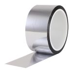
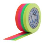
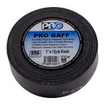
I laid out my tape color palette, using mostly Pro Gaff®, Pro® Spike, Pro® 46, Artist Tape and gold Pro® Sheen. I immediately knew the Pro Gaff® tape would hold up perfectly over my surface. I could mask and layer with the Artist Tape and Pro® 46 and use the gold Pro® Sheen for added dimension and a pop of metallic!
The first thing I did was sketch out the plane in watercolor pencil and began to block in some colors.

The layers began with reddish/brown Pro® Spike tape in the center of the propeller. I also used Pro® 46 light blue to mask the edges off, as well as white Pro® 46 as a guideline for myself in the propellers to keep them symmetrical. The use of Pro® 46 here was only as a guide, as I intended to remove it later. Intentionally, I ripped the Pro® 46 by hand and directionally layered the Pro® Spike tape around the circular area right onto my canvas and over the pencil and water blended areas. Building up the lines and geometric shape, simply with the lines and layers of tape.

I had to allow some dry time between blending the watercolor and application of tape but I was too excited and impatient to get to work and one area had lifted because it was only 75% dry. My impatience soon led me to introduce oil pastels because it has no drying time like with paint. I wanted to layer the tape but also see how well it’s surface worked in combination with my art materials. So far a win!

Close up of masking details on propeller and layers of Pro Gaff® on top of watercolor with reworked oil pastel on surface.
Below you can see how next I began to layer the body and the left wing of the F4U-Corsair. Creating movement and rhythm within the line and curved shape of the plane. The tape has a very straight line but I was able to find harmony in its juxtaposition of form, using the straight lines of the tape to create a curved surface of the body of the plane. At this moment I realized this was my perfect media for collage! I was able to layer multiple colors and widths to find gradation on the contour of the plane. Best of all, the texture of the Pro Gaff® tape gives an overall unique look and a 3D effect.

Continuing on, I painted the sky pulling up the pigments from the watercolor pencil and blending them with acrylic paint. When that was dry, I blended oil pastel and more pencil on top. I peeled back the white Pro® 46 (colored masking tape) to protect the propellers. Below reveals the original lines and shading of my colored watercolor pencil. You can see how the masking held up between layers of paint and blending.
 to protect the propellers. Below reveals the original lines and shading of my colored watercolor pencil.")
I decided I liked some of that added tape texture and line form in the propellers too. I left some tape in place and added more Pro Gaff® white tape layered around the masking. I then continued this area with acrylic paint, pastel and an acrylic blending medium which pulled the watercolor pencil through and brought just the right shaded tone to the form. The areas I had first masked off left the impression behind of highlights. When these layers were dry, I topped it off with some more pastel. The raised areas of tape picked up an interesting texture.

I continued to rip by hand and add multiple layers of Pro Gaff® tape. I focused on the contour of the plane by adding different lengths and widths of tape in a variation of shades to create depth and shadow around the form. Blending pastel right on top of the new surface and even more layers of acrylics and blending medium. I’ve been working on this piece for about two weeks and all of the Pro Gaff®, Pro® 46, Artist Tape and Pro® Sheen have all stayed in place. The extra weight on top of it with watered down and layered paints or oil pastels did not in any way affect the quality of the art piece.

There really are no limitations for the uses of Pro Tapes® quality products and there certainly are no rules for how to create art. Whatever your canvas, whatever your muse, don’t be afraid to explore something new and think outside the box. Add some texture, color and dimension to your art any way you like with anything you like!